Creating the introduction credits for “How to tune a five string banjo tutorial” on YouTube
An edgy introduction
I’m excited to share a recent project that highlights my creative capabilities while providing valuable instructional content. This case study focuses on the title sequence I developed for a short tutorial titled “How to Tune a Five String Banjo Tutorial” where I showcased using the Guitar-Tuna Application.
Disclaimer
I want to clarify that this project was created as part of my student work and is not intended for official use.

Concept and Planning
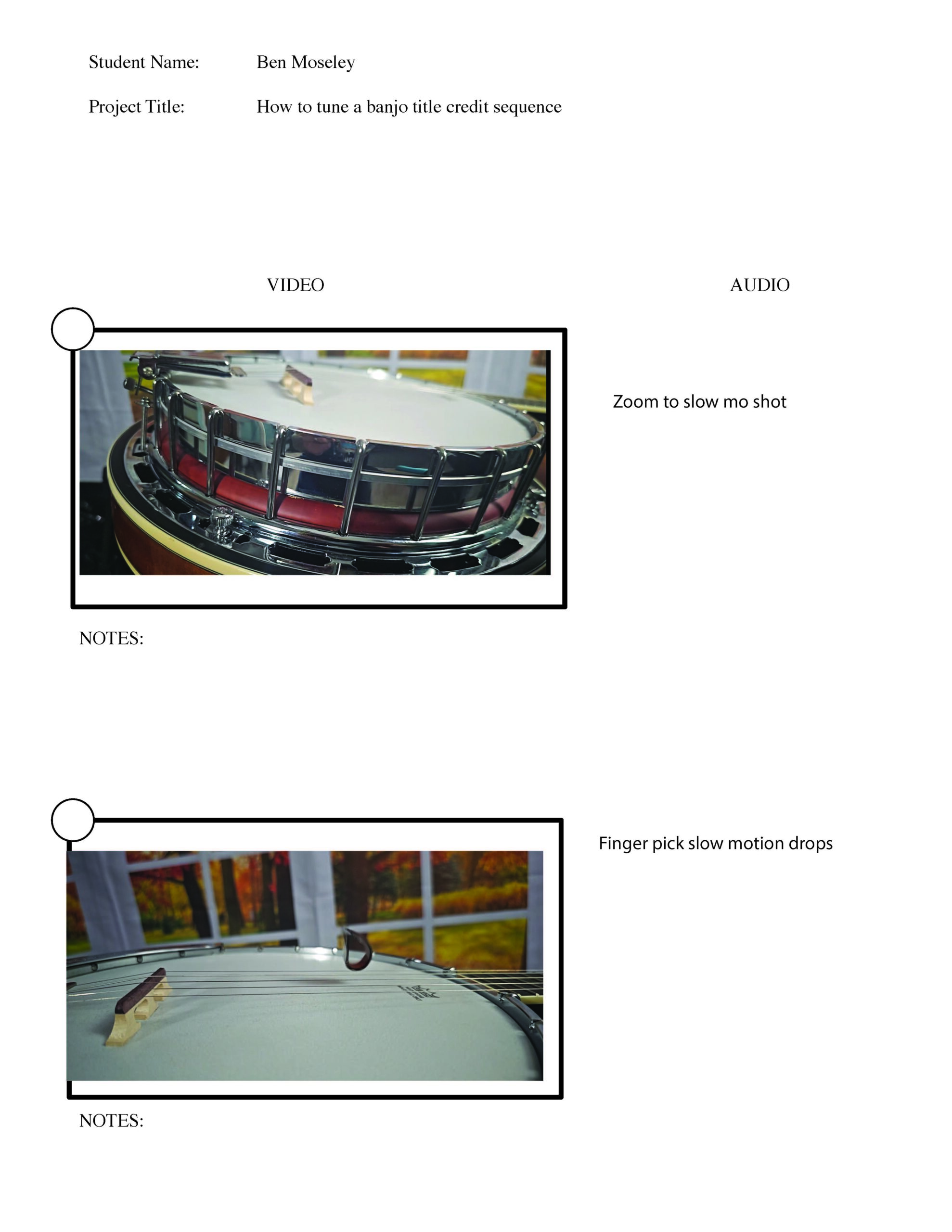
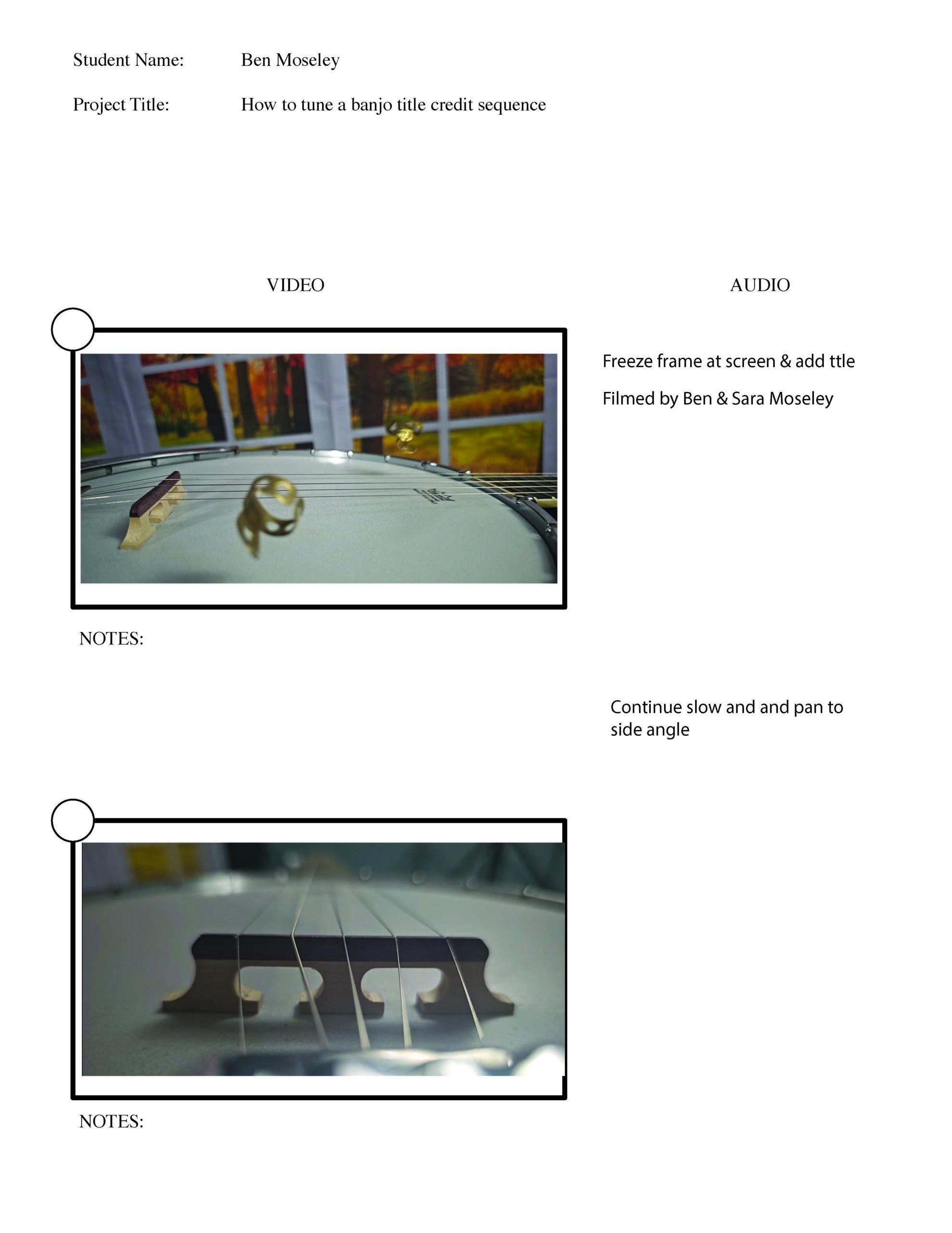
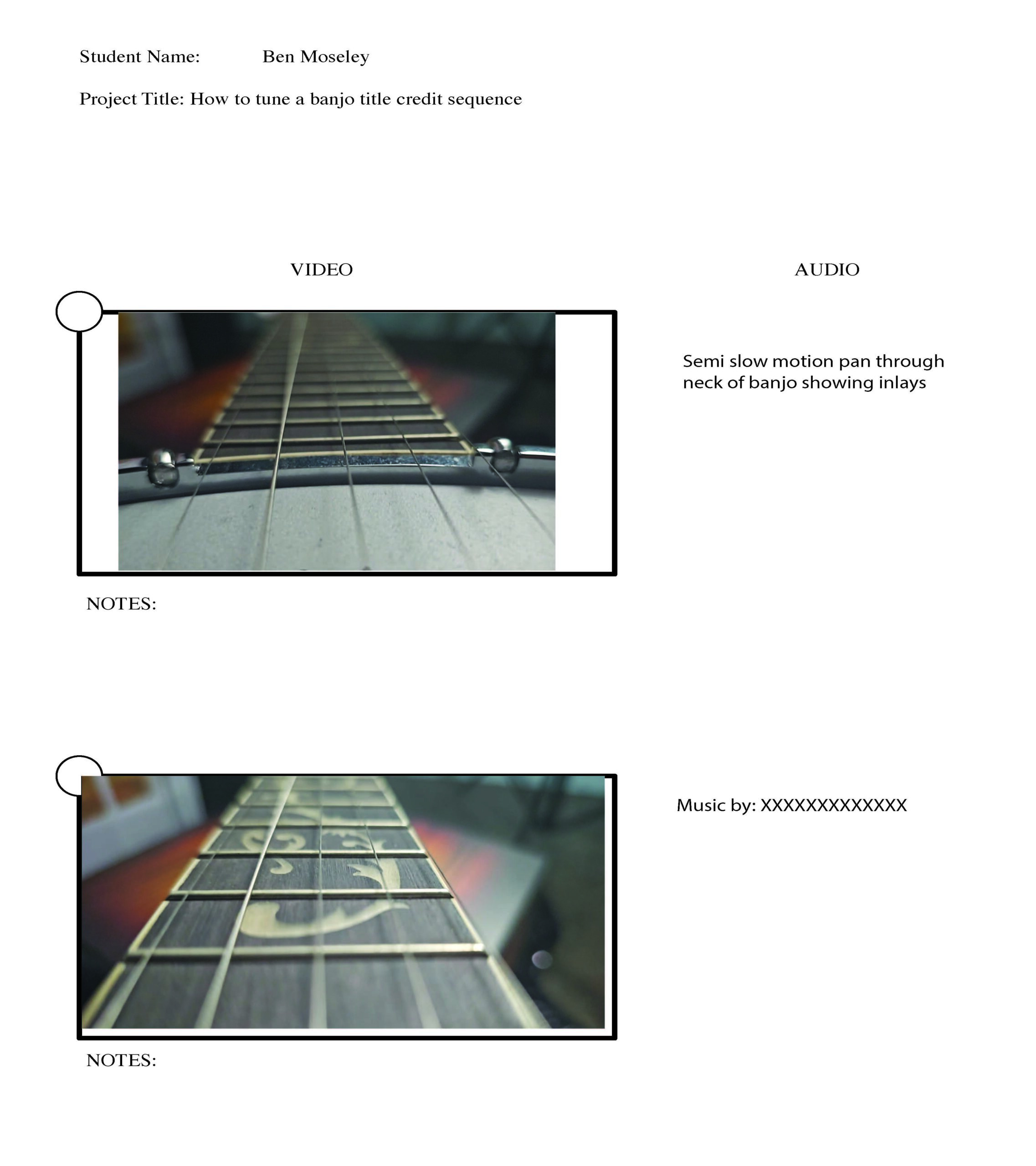
From the outset, I knew I wanted the sequence to blend visual flair with informative elements. I drafted a script and storyboard to guide the creative process, outlining key visuals such as the banjo itself, its accessories, and the Guitar Tuna Application interface. This pre-production phase was essential in ensuring that I had a clear roadmap to follow.



Filming Process
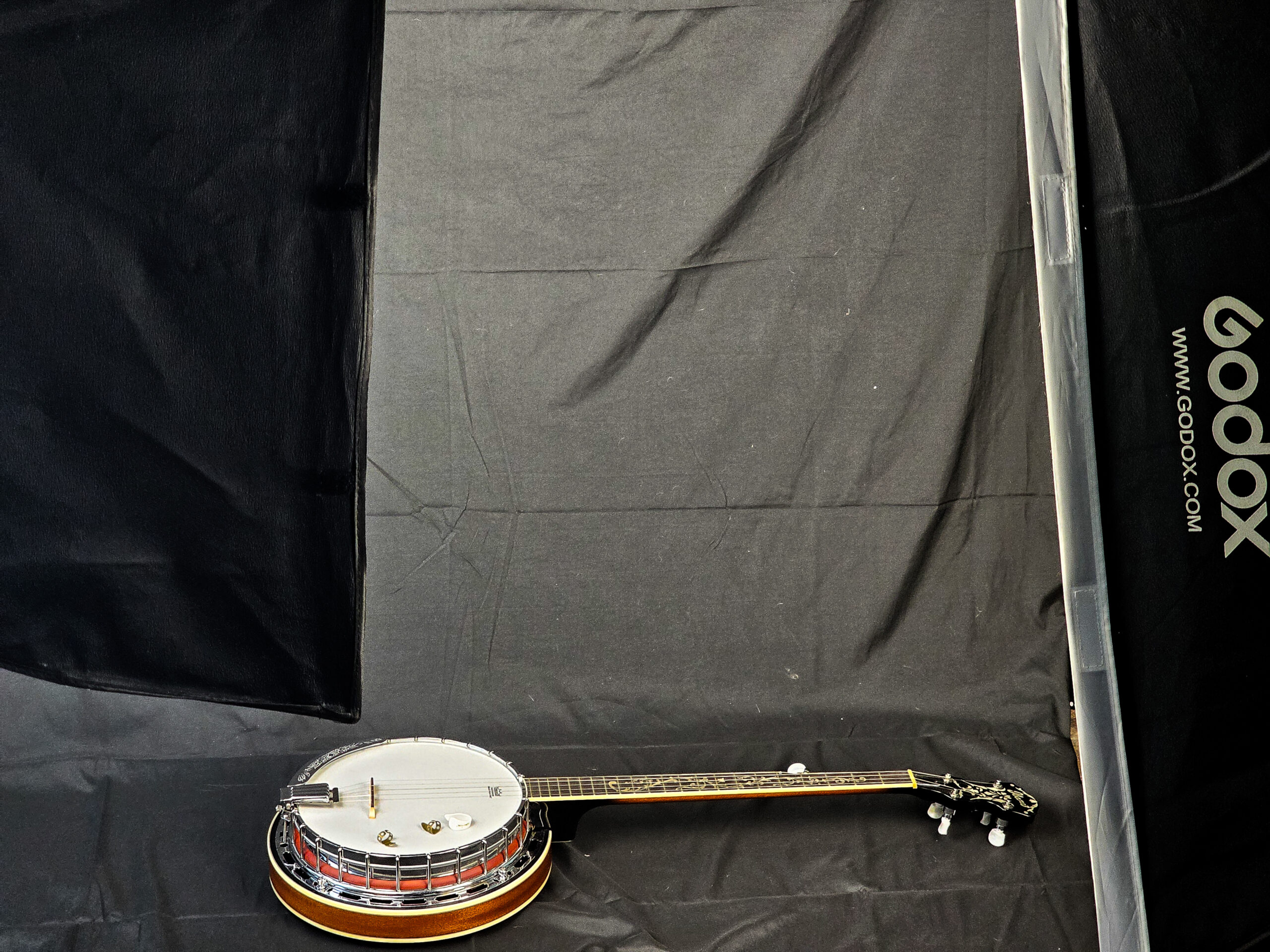
I chose to film the segments in my basement photography studio and the school studio, utilizing various shots to highlight the banjo and its accessories. Lighting was crucial, so I invested time in setting up softbox lights to ensure that the visuals were crisp and edgy. It was rewarding to see the banjo come to life on camera, capturing the essence of what makes this instrument special.
Post-Production Magic
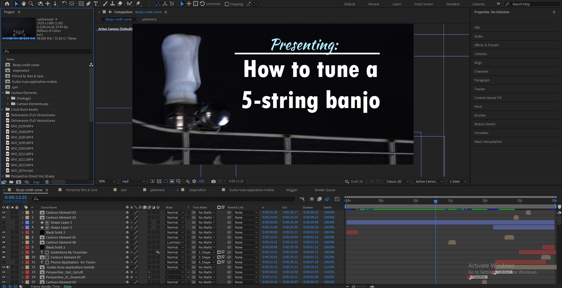
Once filming was complete, I dove into Adobe After Effects for editing. This was where the magic happened. I meticulously crafted the title sequence, incorporating dynamic text animations and smooth transitions that kept the viewer engaged. The visual elements had to work harmoniously with the audio, so I selected music, graphic embellishments, and sound effects from Envato that matched the upbeat and instructional tone I aimed for.
After several rounds of edits and feedback sessions, it was finally complete. The title sequence not only served its purpose but also reflected my passion for both the banjo and video production.

Overcoming Challenges
Every project has its hurdles, and this was no exception. One challenge I faced was maintaining consistent lighting across different filming locations. By using softboxes and reflectors, I managed to create a uniform look that tied the shots together. Additionally, juggling my time between this project and other commitments was a lesson in organization and prioritization.
Final Thoughts
As a designer and filmmaker, I tend to see the flaws in everything I create, but I’m learning that others often see the beauty I might overlook. This project wasn’t just about a title sequence; it was a chance to show what Digi Design Group can do while blending my passion for music and film. Through the process, I was reminded of how powerful storytelling can be when it comes to visuals and sound. In the end, even though I see the imperfections, I’m proud that the final product not only met my vision but surpassed what I thought was possible.

